| What does it do? |
| Happy Customers |
| Special Offer |
| How to Order |
|
Useful
Documents
|
| QuickStartGuide
|
- - -
Screenshots - Income
Graph -
- -
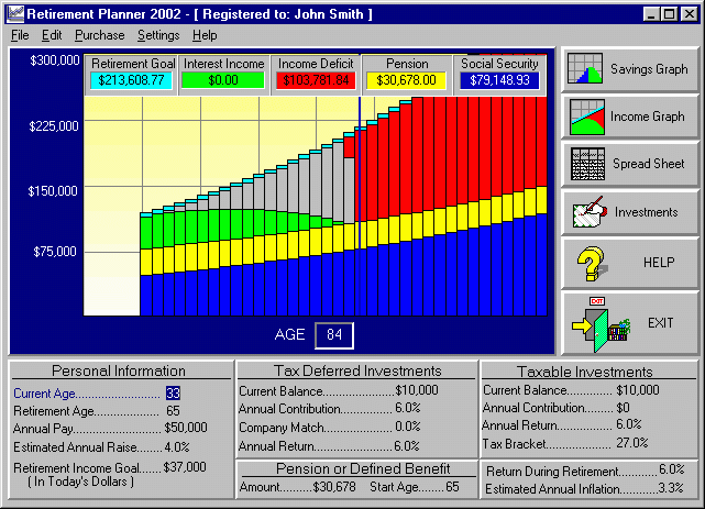
Here is the screen showing the various income sources
being used in retirement. The light
blue shows you the inflated Retirement Income
Goal. The dark blue shows you
the social security estimate. You can actually turn off the social
security estimate under the Settings menu if you prefer not to account
for it. The green shows you
income coming from interest on your savings. The gray
shows you income coming from principal (i.e. you dipped into your
principal to meet the income goal). The yellow
shows you income from a pension. And most importantly, the red
shows you any income deficit, if one exists. Clients like this approach
because you can see the big picture of retirement (i.e. if you see
red you need to rethink your plan), but at the same time you can
see the exact details of where your income will be coming from.

| ORDER RETIREMENT PLANNER 2002 UPGRADE |
PC
Sales, Development & Support
2900
Delk Road
Suite 700-38
Marietta, GA 30067
Ph:
770-579-6224
support@torrid-tech.com
sales@torrid-tech.com
©
Copyright 1995-2002, Torrid Technologies, Inc.
All
Rights Reserved.
All
trademarks are trademarks of their respective owners.